

monstermodels.live | @Strategy modeling | $MSTR $ASST shareholder | Options seller | $STRC $SATA advocate | #Bitcoin | ex-HPC dev | @milkmochabear ❤️
- Tweets 4,449
- Following 147
- Followers 1,202
- Likes 14,247




Pinned Tweet

INTRODUCING THE MONSTER MODEL 🚨📈📊
The laboratory-grade corporate treasury and Bitcoin simulator.
The Monster Model is a fully parameterized discrete non-linear dynamical system that models the complex reflexive interactions between @Strategy, @Strive, and #Bitcoin in a unified framework.
Key features:
→ 345 input parameters. Everything from assumed weekly $STRC / $SATA net proceeds to target amplification range, mNAV variant, and Bitcoin hodler flows is included. Parameters that don't currently apply to your configuration disable or disappear on their own.
→ 159 plottable series. This includes the basics like $MSTR and $ASST share price, Bitcoin price, shares outstanding, BTC reserve, USD assets, Duration, mNAV, and amplification, as well as metrics that are novel to the Monster Model such as $STRK effective in-the-money value, effective sats per share, expected break-even time horizon (EBETH), and Bitcoin's expected one-year forward return. Expected-return premiums for MSTR and ASST, based on work by @stonychambers, are also provided.
→ 36 charts. MSTR and BTC price, BTC reserve, BTC flows, shares outstanding, modeled BTC liquid/illiquid supply, net proceeds, market cap, USD and months of coverage, reserve valuations, mNAV, amplification, sats per share, convertible bond tracking, and more.
→ Powered by a bespoke supply-and-demand price clearing model of the Bitcoin ecosystem. The featured method for modeling Bitcoin tracks projected mining emissions, lost coins, Strategy and Strive's own purchases, hodler withdrawals from liquid float into illiquid storage, and releases from illiquid storage back into the liquid float — cleared against a demand trajectory, week by week, into a price. Switch it on and the treasury companies' own buying pressure feeds back into the prices they pay.
→ 6 Bitcoin price paths, or compose your own. If you prefer a static price path instead of a dynamic one, the Monster Model offers a menu of choices: @Giovann35084111 Santostasi's classic power law; the Bitcoin. com and BitcoinFairPrice variants; @Saylor, @Shirishjajodia and @CJ_Bitcoin's Bitcoin24; @TheRealPlanC's Q1 power law floor; Stephen Perrenod's (@moneyordebt) 8-parameter log-periodic curve. Or build a custom path out of normalized variants of a power law, an S or Gompertz adoption curve, a linear incline, a periodic wave, a decaying exponential, and Perrenod's 8-parameter curve.
→ Full convertible bond accounting. Every bond either company has ever issued or held, retired ones included, with Black-Scholes option deltas producing a novel share accounting method alongside BSO, ADSO and FDSO: *effective* shares outstanding. Parameters govern how eagerly holders exercise puts and conversions, and whether Strategy calls as soon as the bonds' 30% premium condition permits.
→ 5 mNAV variants. Multiple of enterprise value (mEV), plus three variants of price-to-book (P/B) that use basic, effective, and assumed-diluted treatments, plus the recently introduced fully diluted multiple of Net Reserve (mNR) in which out-of-the-money convertibles count as debt rather than as future shares. Picking a variant automatically selects the matching share count *and* liability treatment, so the numerator and denominator can never quietly disagree.
→ 5 ways to drive mNAV forward in time. A constant expansion scalar that gaps and holds; a multiple of break-even mNAV; a parameterized oscillating sinusoid (with or without a decaying amplitude); a linear rise (or fall) towards a terminal mNAV; or an experimental sentiment algorithm built on fast and slow SMAs plus week-over-week Bitcoin moves.
→ Weekly time steps, aligned to the filings. Strategy and Strive announce by 8-K, so the model breathes at that cadence. Quarterly bond interest and monthly preferred dividends land where they actually land, and the rhythm between capital raises is visible instead of averaged away.
→ Real history back to 2024. Common share issuance, BSO, ADSO and BTC holdings, taken from Strategy's 8-Ks — used exactly from mid-November 2024 forward, when the filings became regular. The earlier filings are sparser, so a few of those weeks are interpolated to smooth the gaps between them. (Strive's history starts in September 2025, with weekly 8-K coverage from June 2026.)
→ An experimental credit collateral subsystem. Adoption curves for Bitcoin pledged against credit, with carry spreads, eligible and pledged fractions, and lender LTV — and some of that credit recycling back into Bitcoin demand.
→ STRC volume cycle modeling. If you expect STRC to trade at or above par into its record dates on rising volume, this parameterized sub-model reproduces that rhythm in its projected capital raises. Otherwise, index either an initial weekly net proceeds estimate or a fraction of the total notional value to a growth curve of your choice.
→ One-off equity events. Drop a hypothetical issuance or buyback — any share count, any price, any future week — and watch the proceeds, or the funding deficit, propagate through the same allocation rules as everything else. Try using it to explore the potential impacts of various levels of exercise on Strive's outstanding warrants.
→ 472 modeled series across 8 interconnected systems: convertible debt, preferred equities, common equity, Bitcoin price dynamics, USD assets, the BTC reserve, mNAV, and amplification.
—
And the model is only half of it. The other half is a premium-grade visualization panel built for tweaking and customization.
→ Automatic or manual recalculation. Change any assumption and the entire system re-solves in a fraction of a second. Or, switch to Manual mode and queue up several changes to see their combined effect in a single run.
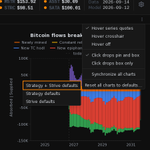
→ A chart grid you arrange yourself. Drag to reorder, insert a slot anywhere, delete several at once with undo, star your favorites. Stretch charts to fit, or size them to the pixel. Embiggen one to the full pane and the rest stop recomputing behind it.
→ Charts that follow your parameters. Set Bitcoin to a static curve and the supply series leave the reserve charts, because supply plays no part in that model. Switch amplification from a ratio to a multiple and the axis, the tick format, the series and its target band all change together, in one step.
→ Pin a reading and watch it move. Hover a chart to read every visible series at that date; press to pin it in place. It holds while you change parameters, with a column reporting how far each series moved since the last run — so you watch a number move instead of remembering it. Synchronize the grid and one press freezes every chart at a single date.
→ Six auto-saving workspaces: five yours, plus a sandbox that catches links other people send you. Keep the bull, base, and bear cases side by side. Give them custom names, copy between them, reset a single tab, export them to JSON and carry them to another machine.
→ Shareable links. Your entire parameter set, encoded into the URL. A scenario that differs from the defaults in a dozen places travels in about 50 characters — it records only what you changed and packs each value into the fewest bits its own range allows. It arrives in a reserved sandbox workspace, so opening someone else's scenario never disturbs yours.
→ Copy any chart as an image. Not a screenshot — composed for the purpose, with its own title, legend and margins, none of the surrounding interface, your hidden series still hidden, your log axes still logarithmic, and your pinned readout included.
→ Live prices. History ends on the last completed week, so the week you're actually in is a live row: mNAV, amplification and reserve value reflect where things stand right now rather than at last Monday's close. Switch it off for the neutral "what if nothing else happens" baseline, or when conducting controlled parameter impact analysis.
→ Operable entirely from the keyboard. Not most of it — every control, every menu, every modal. Including lifting a chart off the grid and walking it to a new slot with the arrow keys, or even repositioning a readout within a single chart.
→ It even works on your phone. The model was built for a big screen and that is still where it shines, but the mobile version keeps the core of it: tap a chart and the marker lands on that date; drag to sweep it with every value updating as it goes; tap again to pin. Tap anywhere else you would normally click on desktop.
→ ~42,000 words of documentation, delivered where you need it. Every one of the parameters, every plottable series and every chart carries a written description on hover — not parked on a docs page you have to go and find.
—
A word on how this was built.
The framework began as a Google Sheets workbook in late summer 2025, built by hand. I had two rules: no formula went in unless I understood how it worked and believed it earned its place; and AI was never allowed to operate on the spreadsheet itself.
The site is that workbook translated into TypeScript and given a thoughtful interface. AI was used heavily and deliberately throughout that process.
I spent 18 years in high-performance computing. That work teaches you one thing above all others: numerical integrity comes first — even before performance — and a number nobody checked is not a result. AI is very good at producing numbers nobody checked.
So every step of the way, the TypeScript output was validated against the source workbook row by row, series by series. Not a spot check.
I've invested over 1,600 hours in the project, the vast majority of that in the last five months. I've never worked harder on anything in my life.
—
The Monster Model is live at monstermodels.live. No account, no signup — and your scenarios never leave your browser unless you want them to.
For the best experience, I recommend using a desktop or laptop browser.
Please give it a try and tell me what you think! And if you like the tool, please consider reposting this announcement.
This has been an incredible journey, but my hope is that this is just the beginning. Thank you all for your support! 🧡
30
27
124
19,721
Mocha retweeted

$0 payout. Still creating. Conviction doesn’t need permission. Bitcoin will win. Never give up. 🧡
 Alex 👽

5
5
23
1,464
Mocha retweeted

Strategy is proposing daily dividends on $STRF, $STRC, $STRK, and $STRD, accruing every calendar day, including weekends and holidays, and paid the next business day, with economics unchanged. The proposed changes aim to support price stability, liquidity, and demand.

775
1,216
9,814
842,387
Fresh off the Monster Model workbench: 🚧🔧⚙️
Zoom in on any stretch of time! 🔍
→ You can now hold Ctrl (Cmd on Mac) and drag across any chart to zoom into that span. The y-axis refits to what's visible. First-time users may prefer to instead click the magnifier icon in the chart's header, and then click-drag normally (no Ctrl/Cmd needed).
→ Your parameters and modeling horizon stay exactly as they were. It's a closer look, not a new scenario.
→ Mobile and tablet users can tap the magnifier, then drag with one finger.
→ Turn on "Synchronize all charts" and every chart zooms together. Bar charts re-bucket to finer bars as you zoom in, so a zoomed flows chart shows finer detail instead of the coarse bars sized for the whole horizon.
→ A pinned reading keeps reporting even if it falls outside the zoomed-in region.
→ Click the zoom-out icon (or Ctrl-double-click) to see the whole horizon again.
Also shipped:
→ Faster updates. Charts that are currently in your grid but off-screen (scrolled out of view) now update themselves without animating, and zoomed charts only redraw the span you're looking at. With a long horizon and a full grid, a parameter change settles noticeably sooner.
→ Copied chart images put the readout where you left it. Drag the readout box beside the marker, against an edge, or across the line, and the copied image keeps that placement at any image size. If you've never moved the readout yourself (or you've recently selected "Reset this chart"), the copy action will place the readout cleanly beside the marker, at the height where you clicked. (If you love this feature, thank @LaDoger!)
→ Standard-size chart image copies now include the readout on every synchronized chart, not just the one you clicked.
→ The hover readout now tracks level with your pointer, so you can park it right at the top of a chart.
Give it a try and let me know what you think! Thanks for being a monster modeler! 🧡
monstermodels.live/
$MSTR $ASST $STRC $SATA $BTC #Bitcoin

I'm about to ship a useful new feature for the Monster Model — one that I had planned since the earliest days, but then mothballed until yesterday.
Rather than launch straight into explaining it, I thought I would give you a novel kind of preview.
Many of you may be wondering what it's like to build an app like the MM. What kind of tools do I use? What expertise do I rely on? What parts do I do myself, and what parts does Claude Code do? These are all excellent questions — some of which are already partially covered by the website's FAQ — and I hope to further demystify many of them over time.
They say a picture is worth 1,000 words. But a picture won't help you understand my process as well as a 25,000-word transcript of my two-day session with one of Anthropic's most powerful models (Opus 5.5).
I don't expect you to read the whole thing, but I know some of you weirdos may enjoy diving into random parts of it. I know you're out there, because I'm one of them. (@AngryBuhda: This should come as no surprise to you. 🤣🤣)
I'll follow-up later with a more social-media-friendly executive summary / changelog.
Hope you enjoy this behind-the-scenes peek at how the building happens!
drive.google.com/file/d/1Hpx…
$MSTR $ASST $STRC $SATA $BTC
1
11
314
I'm about to ship a useful new feature for the Monster Model — one that I had planned since the earliest days, but then mothballed until yesterday.
Rather than launch straight into explaining it, I thought I would give you a novel kind of preview.
Many of you may be wondering what it's like to build an app like the MM. What kind of tools do I use? What expertise do I rely on? What parts do I do myself, and what parts does Claude Code do? These are all excellent questions — some of which are already partially covered by the website's FAQ — and I hope to further demystify many of them over time.
They say a picture is worth 1,000 words. But a picture won't help you understand my process as well as a 25,000-word transcript of my two-day session with one of Anthropic's most powerful models (Opus 5.5).
I don't expect you to read the whole thing, but I know some of you weirdos may enjoy diving into random parts of it. I know you're out there, because I'm one of them. (@AngryBuhda: This should come as no surprise to you. 🤣🤣)
I'll follow-up later with a more social-media-friendly executive summary / changelog.
Hope you enjoy this behind-the-scenes peek at how the building happens!
drive.google.com/file/d/1Hpx…
$MSTR $ASST $STRC $SATA $BTC
1
3
607
Mocha retweeted

$BTC: HALF THE GAMMA JUST DISAPPEARED
Today’s expiry removed 51.8% of gross gamma from the board.
Dealer GEX reset:
−$327M → −$203M
Dominant gamma strike:
$85K → $90K
Less leverage/pinning. The biggest options gravity just moved $5,000 higher.
BTC is $83.8K.
If price starts running, the remaining negative-gamma structure can force dealers to buy into the rally.
The model estimates a +5% breakout with rising volatility could generate ~$1.1B of hedge buying.
The expiry didn’t create the rally, but it removed part of the brake.
$90K is next.

18
44
386
21,142


The era of always-on capital markets is here. Daily dividends, 365 days a year.

85
175
2,264
63,008
Mocha retweeted

Stroke of a Pen
I told Opus 5.5 to read my Bitcoin & monetary-history wikis & make a music video with code only.
it used ElevenLabs for the track.
Then a swarm of agents storyboarded and coded a 3:23 portrait reel. ~75 shots cut on the beats.
Had to do 2 revisions - first the people looked like poorly animated stick figures & it rewrote the rigs.
Then I said use matrix code to make it more interesting.
Impressive!

107
235
973
171,250
Mocha retweeted

Comparing gold, Bitcoin and the S&P500, which has the record for the longest stretch underwater (price sitting below its all-time high)?🤔
- - -
This kind of blew my mind.
If you take a look at depth and breadth of drawdowns for each, Bitcoin obviously takes the prize for depth 🟠
But, it ranks 2nd in terms of time spent underwater - a record of 1,175 days (~3.2 years), compared to
🔵 S&P's 744 days (~2 years), and
🟡 gold's 3,256 days (~8.9 years)
Gold fell less than HALF as far as Bitcoin, and took almost 3x longer to recover from it.
I'll take the violent drawdown that ends over the shallow one that just sits there, especially as Bitcoin's path seems to be fairly predictable.

10
7
67
5,515
Mocha retweeted

Mocha is on fire! The models are comprehensive, accurate, and continuously evolving targeting what is most useful and most true.
An BTCTCs should be using this to help present the amazing opportunity of putting BTC on the balance sheet.
As I alluded to earlier today, I've spent the last two days working on an exciting feature that captures an important nuance in Bitcoin treasury management.
The idea is simple. Every Bitcoin treasury company runs some amount of amplification (leverage) — primarily preferred stock or convertible debt — against its BTC. More amplification means more BTC per share on the way up. It also means the common equity gets wiped out faster on the way down.
Until now, the Monster Model let you set a constant amplification target and watch what happened as the dynamic treasury management engine attempted to steer either company towards its target under the conditions set by your other parameters (BTC projection path, $STRC / $SATA growth path, USD management, etc.).
But that didn't prevent the modeled company from drifting towards a balance sheet whose equity is wiped out in a crash.
Now you can pick a share price you want $MSTR or $ASST to survive down to, and the model solves for the most amplification the company could carry if Bitcoin fell and mNAV collapsed.
I call it the defensive amplification target, and it's now fully integrated into the dynamic treasury engine. If the system can run nominally, it does; but if the balance sheet gets stressed according to the parameters you specify, it sounds the alarm and begins taking decisive action.
The feature calls for you to give it three things: (1) a share price to defend; (2) an mNAV to assume in the crash; and (3) how far Bitcoin might fall (as a fraction of its power law trend). The model works backward to the maximum liability load that still clears your defensive price, converts that to an implied amplification target, and pulls the company's target amplification down to that implied target whenever your own constant target would be higher.
The new feature is off by default, so if you want to experiment with it, you'll need to toggle its checkbox, which you can find in the "Defensive target" fieldset in the Amplification section of the parameter pane.
Two things I learned while building it that I didn't expect.
→ The first: capping the target isn't enough. The model doesn't hold amplification at the target — it accepts anything inside a tolerance band around the target, and only acts decisively to delever when amplification exceeds that band. So the target can read as being exactly where you set it while actual amplification sits at the band's upper edge, above your limit. The defense mechanism has to bind the upper edge, not the center; otherwise the width of the band is amplification you never authorized. At the sensitivities involved, a tolerance of 0.01 (one percentage point) in amplification ratio is worth about a dollar of share price — so your $80 floor quietly becomes a $79 floor.
→ The second: which dollars count. The model tracks "effective USD" — an internal metric inspired by the extension of the model (which was originally @Strategy-only) to @Strive. The Monster Model defines effective USD as all USD assets plus a user-specified haircut on any third-party perpetual preferreds the company holds. That's fine for normal reporting. But as we saw this summer, perpetual preferred equities are least saleable exactly when the common equity is under the most stress, which is the scenario you're trying to defend against. So the defensive calculation uses pure USD while everything else keeps the effective figure. Two different questions, two different answers. (If you don't like the idea of valuing PPE above $0 even during normal operation, feel free to change that parameter; it's called "Fraction PPE counted in Effective USD" and can be found in Strive's "USD and PPE Assets" section in the parameter pane.)
If I'm being totally honest, this new feature is just absolutely sick. Watching the dynamic treasury management logic simultaneously dial back on preferred issuance while ramping up use of the common equity ATM to delever so that it can defend your chosen share price at your chosen power law level is an almost religious experience. This is reflexivity in motion, and highlights the power of modeling treasury companies (and Bitcoin itself) with a non-linear dynamical system.
Also shipped:
→ A break-even mNAV basis toggle. Break-even mNAV marks where issuing common stops being accretive — but "accretive" has two meanings. Gross BTC per share is the one BTC Yield measures, and it ignores liabilities entirely. Net BTC per share counts only what's left after senior claims. Those give different answers, and the model was silently picking one based on which mNAV variant you were looking at. Now the user gets to choose, and the choice is always explicit. This is what I called a semantic bugfix in my earlier post from this morning.
→ As for the technical bugfix I alluded to — that turned out to be a false alarm stemming from Opus's misunderstanding of some of the nuances of the model's mNAV calculations. Once it understood, the issue became clearer, and the LLM agreed that there was only ever a semantic ambiguity.
→ The power law reference curves moved from +/- 40% to +/- 50% of trend, which is a more honest benchmark after the drawdown we just lived through.
→ And a batch of quieter fixes: terminology standardized across the parameter and series documentation, so "selected liabilities" and "USD assets" mean one thing each instead of three.
The new changes are live at monstermodels.live. Please let me know if you encounter any issues, and as always, thank you for your support. 🧡
$MSTR $ASST $STRC $SATA $BTC #Bitcoin


1
1
3
189
Mocha retweeted
The age of Digital Assets and Digital Intelligence needs a bill of digital rights.
My policy prescriptions for prosperity from a fireside chat with @BitcoinConner at @BitcoinPolicy’s Freedom Tech DC summit.
michael.com/transcript/saylo…
179
275
2,454
189,982
In this post, Adrian shares an insightful, outside-the-box analysis of market performance of $SATA and $STRC.
In my view, many people's recency bias is leading them to think that SATA has performed significantly better than STRC, but his analysis of the data suggests the gap is much smaller than most would think.
I also appreciate and recognize the lens through which he is viewing the @Strive dividend premium: compensation for the additional risk of investing in an issuer with higher amplification, a much smaller capital base, and a much shorter operating history. I think that is the right lens, and while reasonable minds can debate prescriptions for optimizing the current product structure, it's clear that @Strategy is trying to set the benchmark. And the benchmark, by definition, doesn't try to chase risk on the credit spectrum.
Thanks for sharing, Adrian! 🍻

I think much of the conversation around $STRC | $SATA and dividend rate(s) is missing a critical point: Proximity to Bitcoin and the respective issuers is central to understanding why $STRC (and $SATA) carry the highest stated dividend rates among the five Digital Credit offerings.
The rate is not simply SOFR plus a spread. Strategy’s own guidance says they review trading levels, market yields, credit spreads, $BTC price and volatility, USD Reserve coverage, capital market conditions, and capital structure together.
The dividend rate(s) compensate holders, in part, for risk in the capital structure that flows from $BTC and the respective issuer. The path of $STRC moving that rate from 9% at launch to 12% (as of September 2026), in my view, reflects that risk premium being discovered in real time.
In the case of $SATA, I view the higher dividend rate as partly reflecting a different issuer risk profile: a smaller issuer with a smaller $BTC balance sheet. The key is the coverage that $BTC provides relative to the issuer’s obligations, alongside its liquidity. The rate (and frequency) are product features; I see the higher rate as compensation for the additional risk holders are taking.
An offering with a 12% stated dividend rate does not necessarily attract the same investor cohort as a bank-issued preferred like JPM-PC or WFC-PL.
These Bitcoin-derivative perpetual preferreds naturally appeal to a different cohort; one native to (and familiar with) $BTC risk, yield-seeking, and, in some cases, leverage. Which, ironically, is what @PhongLe pointed to as a contributing factor in $STRC volatility: they did not expect that amount of leverage to build up.
The product isn’t broken; it’s finding market | cohort fit driven by the TAM of its investor base as it scales alongside the $BTC on the balance sheet, not by dividend frequency or rate alone.
Over the same 215 sessions through September 18, both offerings closed in the $95–$99.99 band most days, with $STRC spending more time at or above $95 than $SATA did: 78.1% versus 69.8%. $STRC also spent more time below $90 [14.4% versus 5.1%], and that detail matters.
This is consistent with the product finding the market cohort willing to hold a BTC-deriviative | BTC-linked pref. I don’t read it as evidence of a failed offering.

4
2
35
1,451
Mocha retweeted

I look to @AngryBuhda for @Strive ASST option analysis. That's the tweet. Bullish.
Plan accordingly.

ASST and what's living and breathing in the Data:
Warrants are what everyones looking at so let's see how the last few months have looked and how significant Monday through Wednesday were.
4 Slides showing:
How Far It Moves,
What Changed,
What the Premium Buys , and
What Happened This Week
$BTC $ASST $SATA $MSTR $STRC
cc.
@GrainofSaltSF @AdamBLiv @ZynxBTC @PunterJeff


6
8
157
19,083
Mocha retweeted

I just walked past a quarter on the ground in Grand Central. No one was stopping to pick it up. Next comes the dollar. Buy Bitcoin.
7
8
186
3,363


Mocha retweeted

ASST and what's living and breathing in the Data:
Warrants are what everyones looking at so let's see how the last few months have looked and how significant Monday through Wednesday were.
4 Slides showing:
How Far It Moves,
What Changed,
What the Premium Buys , and
What Happened This Week
$BTC $ASST $SATA $MSTR $STRC
cc.
@GrainofSaltSF @AdamBLiv @ZynxBTC @PunterJeff
12
12
155
37,198
I love the visuals behind this infographic. So I thought I'd jot down some notes to help anyone who was a bit confused by the column headings...
→ At first I thought it was showing an equivalence between the older Amplification ratio (AR) and the newer Amplification [multiple] (AM) metrics. (It turns out that it *does* allow this comparison, but in a roundabout way. Read on to see how!)
→ Upon closer inspection, it appeared that the infographic implicitly was using ONLY the AM metric. The reason I thought this is that column 2, semantically speaking, is consistent with column 3.
→ But, somewhat confusingly, column 2 is labeled as "Amplification Ratio" when Strategy (and others) refer to that concept as Amplification (which is a multiple, which, I suppose now that I think about it, is a different *kind* of ratio).
→ The infographic then appears to subtract 1 from each row's AM to arrive at what it calls "Amplification" in column 1. But be aware that despite being expressed as a percentage, that first column is *not* equivalent to the older AR metric @Strategy and others used. AR is defined as senior claims divided by BTC assets (or BTC + USD, depending on how you define it).
→ It's actually the third column that is Amplification Ratio in disguise. 🥸
→ So in the end, the infographic *does* allow you to see the equivalence between AM and AR. It's just the labels that are not quite intuitive.
In summary:
→ Column 2 shows the Amplification multiple (AM).
→ Column 3 shows the Amplification ratio (AR).
→ Column 1 shows AM minus 1 -- which does not correspond to any official metric that I've seen and is a bit of a red herring.
🍻
$MSTR $ASST $BTC #Bitcoin


2
2
11
1,097